

Add and customize a light
Make a Light widget for one of your rooms. Start from a preset, give it a useful name, then adjust the elements and appearance to suit your dashboard.
Before you begin
Section titled “Before you begin”Open a canvas in the editor. To start fresh, choose New canvas in the Canvas Library, give it a name and select Create. Your Home Assistant connection should be set up, with a light available to select.
The controls available on the finished widget depend on the light: a dimmable light can expose brightness, while color and color temperature need support from the device.
1. Add a Light widget
Section titled “1. Add a Light widget”Select Add (+) at the bottom of the left panel, then choose Light. Pick a preset that gives you a useful starting layout. We use Signal in this walkthrough, but you can start with any design you like.
Use Select Entity to choose your Home Assistant light, leave Placement on Canvas for this first widget, and select Add Light.
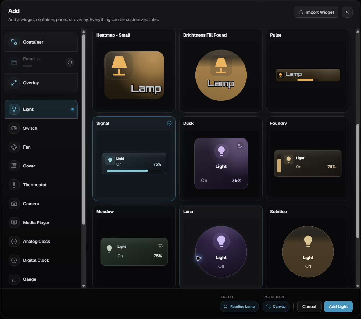
Different presets are different designs of this same Light widget. Choosing a horizontal preset doesn’t prevent you from changing the arrangement later.
2. Give it a name and choose the content
Section titled “2. Give it a name and choose the content”Select the new widget on the canvas. In the right panel, use Custom Label to give it a name that makes sense in the room. We’ve called ours Reading corner.
Open Content and decide what you want to see. Keep the label and icon, and show the brightness if it’s useful. Hide details you don’t need on your everyday dashboard, such as the entity ID.
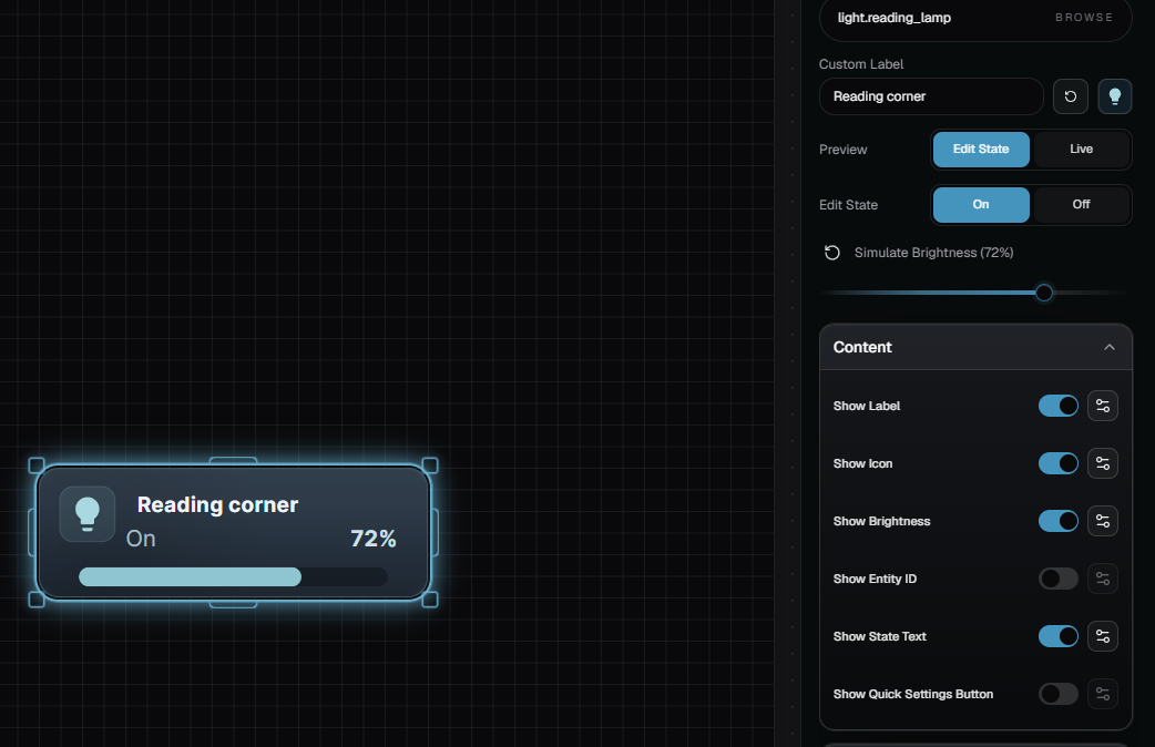
Each element has its own controls. Open the settings beside the label or icon to change its size, color or position. Leave room between the label, icon and brightness display, especially if the name might be longer on another light.
Try Label Settings first. Change Label Size, then adjust Label X Position and Label Y Position. Watch the label move without dragging the icon or brightness bar along with it. Our example uses 20 px, X 25% and Y 25%; choose values that suit your own card.
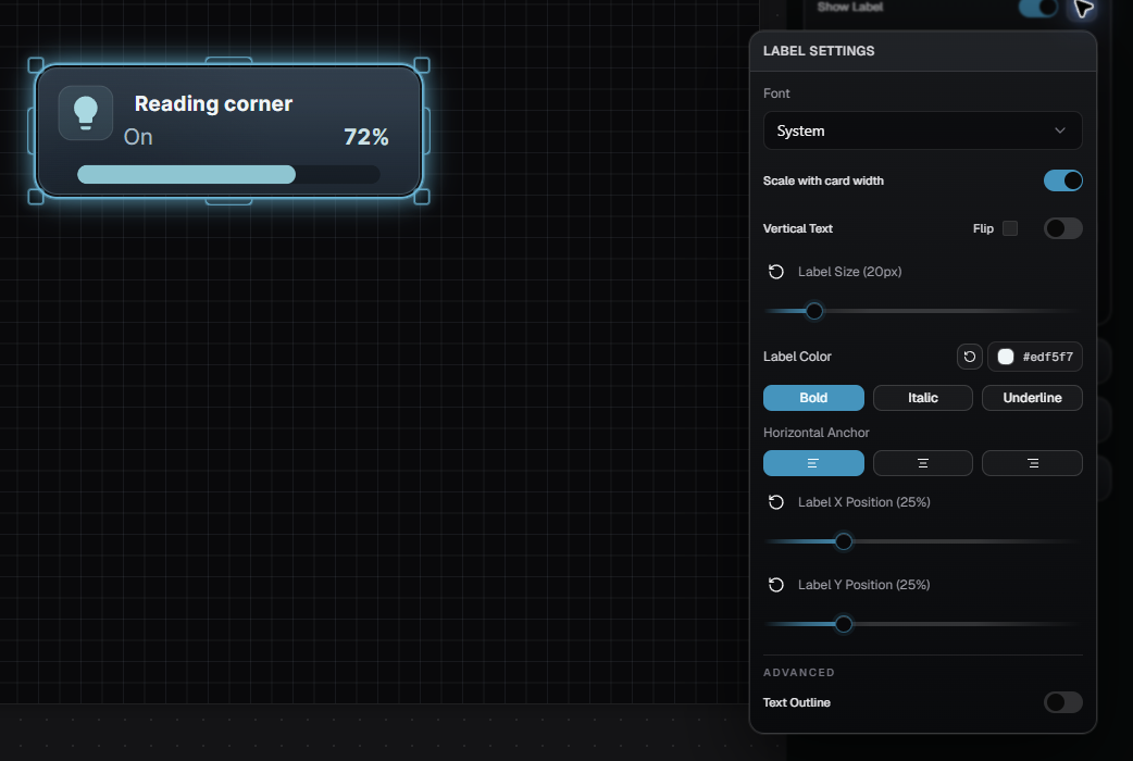
Switch Edit State to On. Content is shared by the widget and is hidden while you’re editing its Off appearance.
3. Arrange the control and background
Section titled “3. Arrange the control and background”Use Visual Style to choose how the light’s fill is displayed. Horizontal Bar and Vertical Bar give brightness its own track. Other fill modes let the light’s state appear within the card itself.
Keep Horizontal Bar for this example and open Fill Settings. Change the bar’s width, thickness and position to fit the space beneath your label. Here we’ve used Bar Width 80%, Bar Height 18 px and Bar X Position 10%.
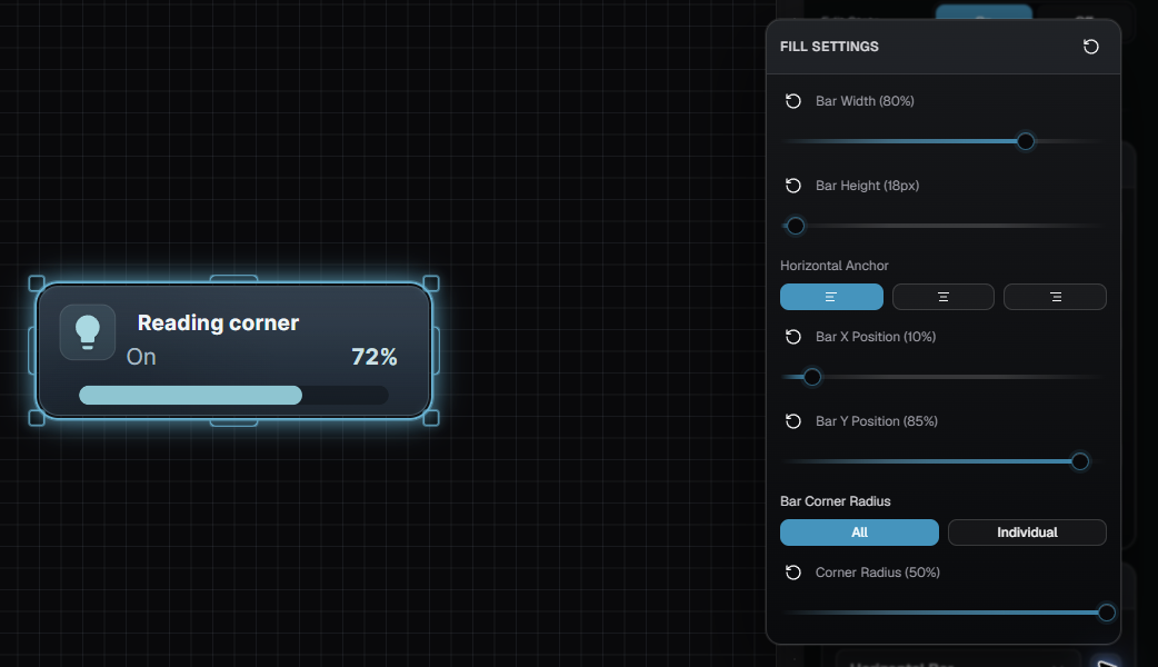
The active fill and the background are separate. Change Background Fill to style the surface behind the label, icon and control. Use a chosen color for a consistent room palette, or entity color when you want the widget to reflect the light’s color.
For the surface shown here, turn Use Entity Color off, choose Solid, and set Background Fill Color to #243A49. Leave Dynamic Color Intensity off to keep this surface consistent as the light dims.
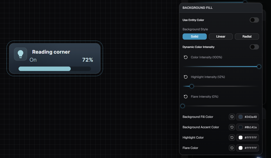
Open the element or fill settings to adjust positions and proportions. You can move the label, resize the icon and reshape the brightness control independently. Check the whole composition after each change.
Under Effects & Surface, adjust the border, glow and corners as needed. Start with a clear, readable card; add effects when they help it fit the rest of your design.
4. Check dim, bright and Off
Section titled “4. Check dim, bright and Off”Set Preview to Edit State and Edit State to On. Use Simulate Brightness to check the design at low and high levels. Keep the label and brightness readable throughout the range.
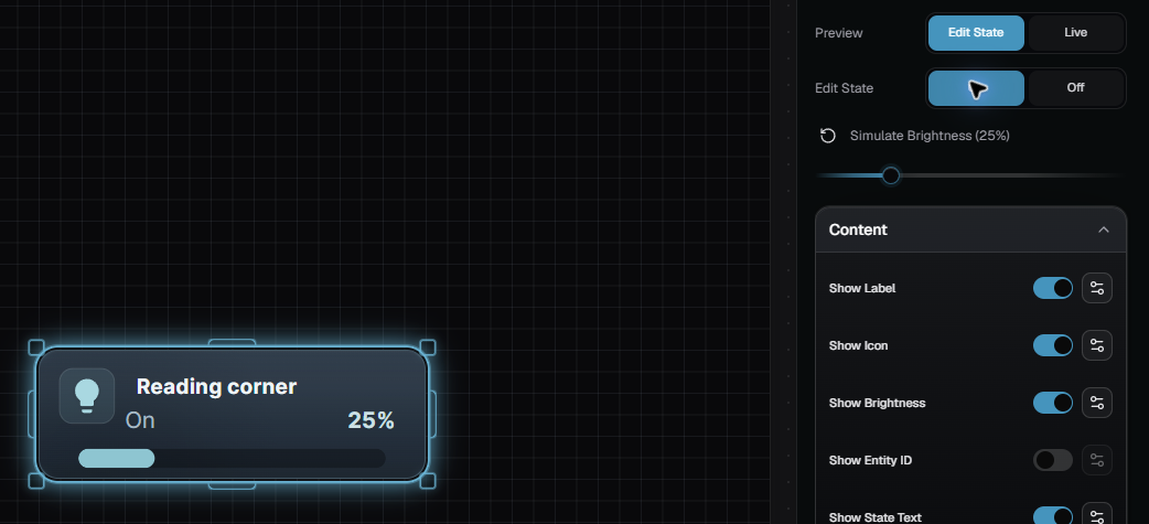
If the background becomes too dark when you dim the simulated light, check its dynamic intensity settings. A higher minimum can keep a pale surface readable without changing the real bulb’s brightness.
Then set Edit State to Off. Decide whether the widget should keep the On background or use a separate Off treatment:
- Turn Override Background off to inherit the On background.
- Leave it on to choose a different background for Off.
Check the icon, label and remaining text against that background. An Off widget can keep a light surface; it doesn’t need to become a dark tile.
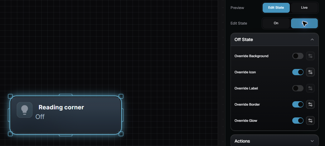
Edit State and Simulate Brightness let you check the design without switching the light. The interactive dashboard preview can control the real device.
5. Save it and use the design again
Section titled “5. Save it and use the design again”Changes save automatically. Check the save indicator beside the canvas name before leaving; you can also select that save icon to save immediately. Reopen the canvas to check the result.
Choose Save Preset if you’d like this design as a starting point for another Light widget. Under User Presets, select + Create New, give the design a name, then select Save preset. It will appear in your personal collection.
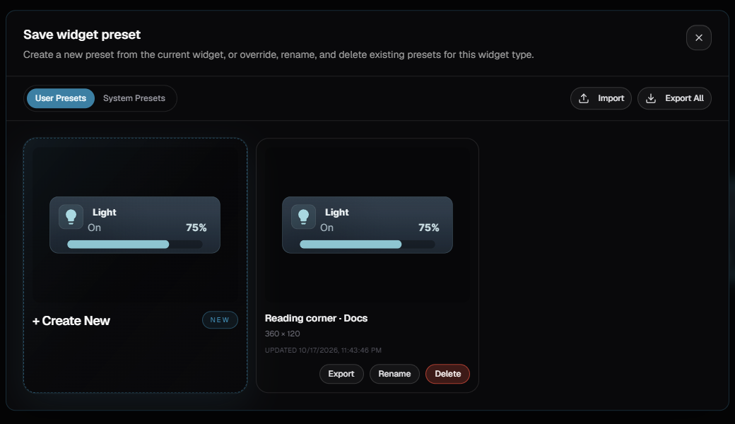
If you’re restyling lights that are already on the dashboard, use Copy Style instead so each one can keep its own device assignment and label.
A few useful checks
Section titled “A few useful checks”Color or temperature controls are missing. Check what the selected Home Assistant light supports. Those controls aren’t available on every device.
The widget doesn’t show the state you’re editing. Set Preview to Edit State. Live follows the physical device even when you’re editing a different appearance.
Text overlaps after resizing. Recheck each element’s size and position at the new card dimensions. A preset’s layout is editable, so you can give a longer label more room or hide an unnecessary readout.